
Overview
Ourdate is a startup preparing to launch a unique dating app designed to help busy people find authentic connections and encourage them to go on dates and meet in person.
As a UX Design intern, I primarily focused on generating a wide range of design ideas and creating prototypes. The CEO tasked me with producing various user interface design options based on research data and user testing feedback. These designs were aimed at helping the development team build a minimum viable product (MVP).
Project Type
Internship Project
Role
UX Design Intern
Year
May 2022 - Aug 2022
Tools
Figma
challenge
Busy individuals struggle with inefficient matching systems on current dating apps, leading to endless swiping, flaky behaviors, and the hassle of coordinating dates. The challenge was to design a solution that helps users quickly make meaningful connections and seamlessly organize in-person meetings.
project goal
Simplifying the dating process for busy individuals.
Enhancing compatibility matching.
Streamlining real-life interactions.
Initial Audit/User Testing
When I joined the project, I conducted user testing on the original designs handed down by previous interns. My focus was on understanding how users interacted with the app's core features, starting with the onboarding screens.
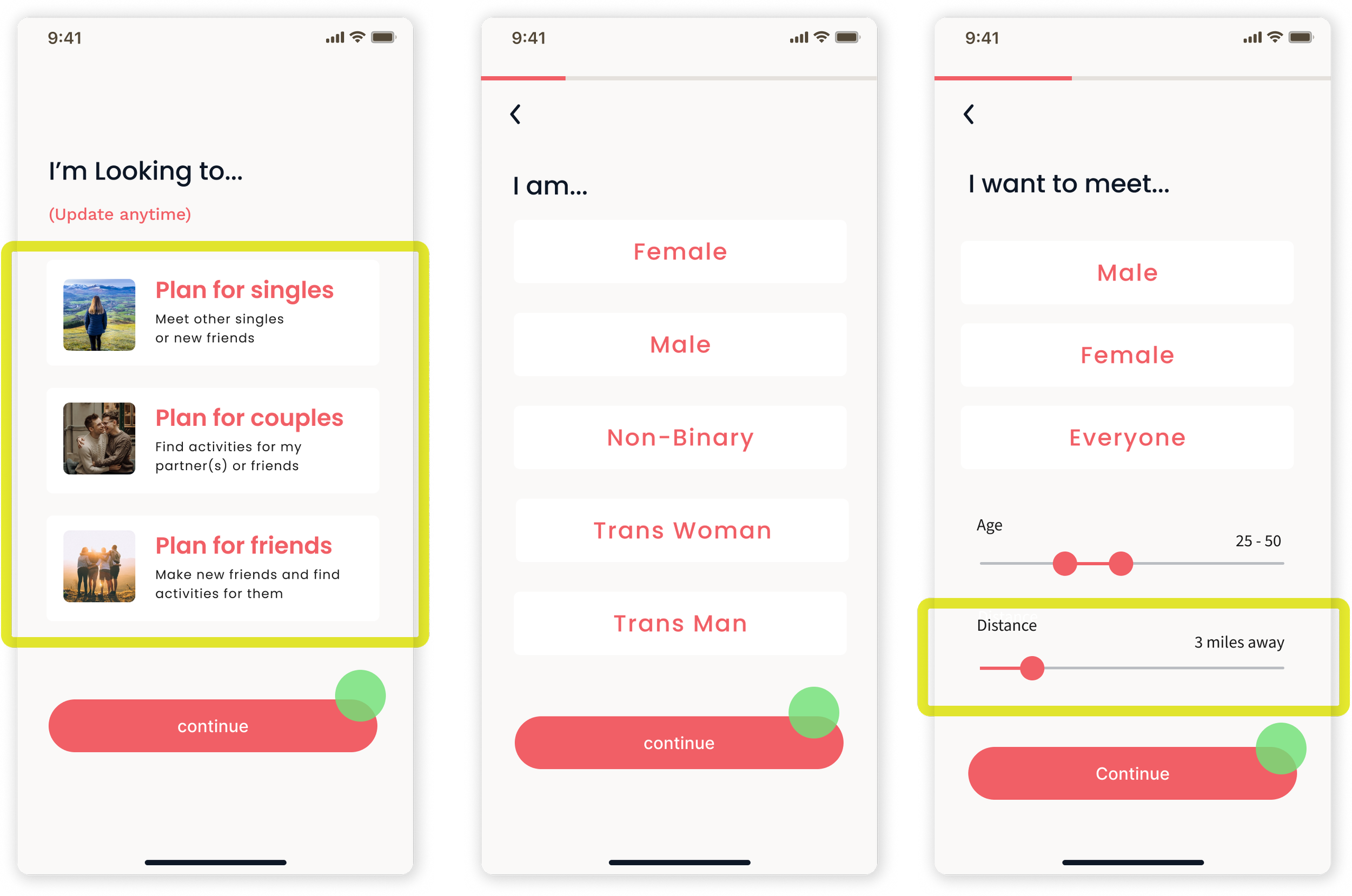
Onboarding Screens
ISSUES
Confusion between 'Plan my date' and 'Plan our date.'
Lack of inclusivity in gender options.
Confusion over distances displayed in kilometers.

Key Changes:
Change the wording for more clarification.
Made gender options to be more inclusive.
Change the unit of measurement to miles.
Date Planning
ISSUES
Users did not understand what the “Invite” button indicated.
Users got confused by term of “Romantic & Relaxing”.
They were not aware that they could select multiple options when sending an invitation.

Key Changes:
Replaced with “Details” button.
Changed the itinerary title to “Dinner & Sunset” for clarity.
Changed the radio button to the checkbox for multiple options.

Discovery & Matching
ISSUES
Users could not tell what bubbles were representing.
Confusion about the matching system.

Key Changes:
Added the percentage of compatibility to each profile.
Added a heart button to express a user’s interest.

After I presented my first iteration, our team and the founder wanted me to further refine and expand the idea to create a more unique and considerate design for our target users, who don't have enough time to meet others.
“How can we make our product stand out from other dating apps?”
“Is there a better way to help connect people who are looking for authentic relationships?”
Further Research
I conducted a new user survey:
Target users: Busy professionals age between 25 - 45
More than 50% of people think the swiping mechanism is ok or not great.
More than 80% of people are looking for serious relationships from dating
More than 50% of people are interested in using a pre-planned date feature.
User Flow
After collecting user research data, I took the initiative to create a new user flow.


Design System
After conducting the second user test, I realized that we needed a solid design system to ensure a cohesive and consistent user interface, ultimately enhancing usability.


Website Design
Additionally, I designed the website with a focus on clearly communicating how the app works, making it easy for anyone to understand quickly and easily.

What I learned
Putting myself in the target users' shoes allowed me to understand and empathize with their needs and pain points, which is one of the most important aspects of creating a successful design product.
I also learned that inventing and introducing a new matching system was challenging because people are accustomed to the widely used systems in popular apps.
Next step
Conduct further user testing with the new design and communicate with the engineering team to validate the solution and its feasibility.