
Amazon.com
Enhancing Amazon Shopping Experience.
Overview
Goodtime is a productivity app that helps users maintain work-life balance during and after the COVID-19 crisis. This project was done in 5 weeks for a Hakathon-style design event.
Project Type
Collaborative Project
Duration
5 weeks
Team
Aditya Singh (SDE)
Danielle Belliveau (UX Design)
Rajshree Mondal (PM)
Client
Product Splash
My Role
User Research, Wireframe, Prototype
Tools
Adobe XD
Problem
The COVID-19 pandemic has presented new challenges for millions of workers and students worldwide. People have struggled to maintain their work-life balance because they have to manage their time alone while working and learning remotely. It also affected people’s productivity and mental health negatively.
Solution
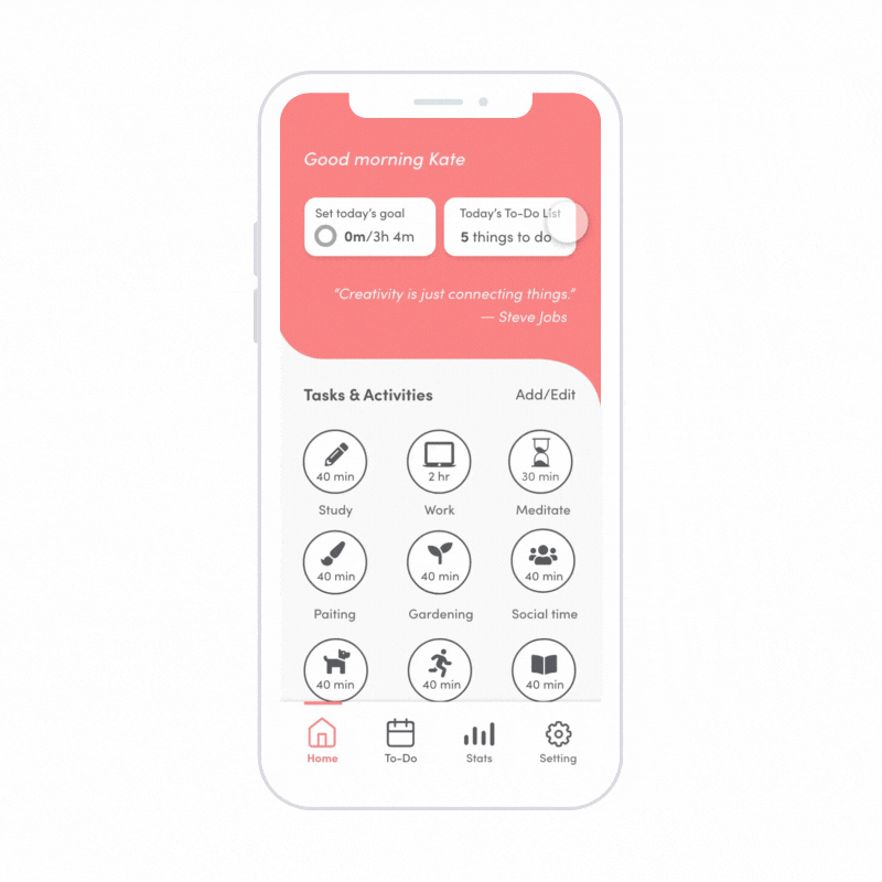
Productivity Timer
Allows users to set a timer to focus on their desired activities such as studying, working, meditating and etc.
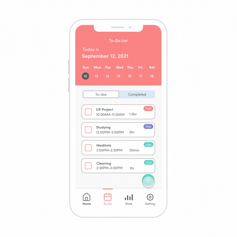
Calendar/To-Do List
Jot down all of your recurring dates and activities. Organize tasks, lists, and reminders to stay on track.
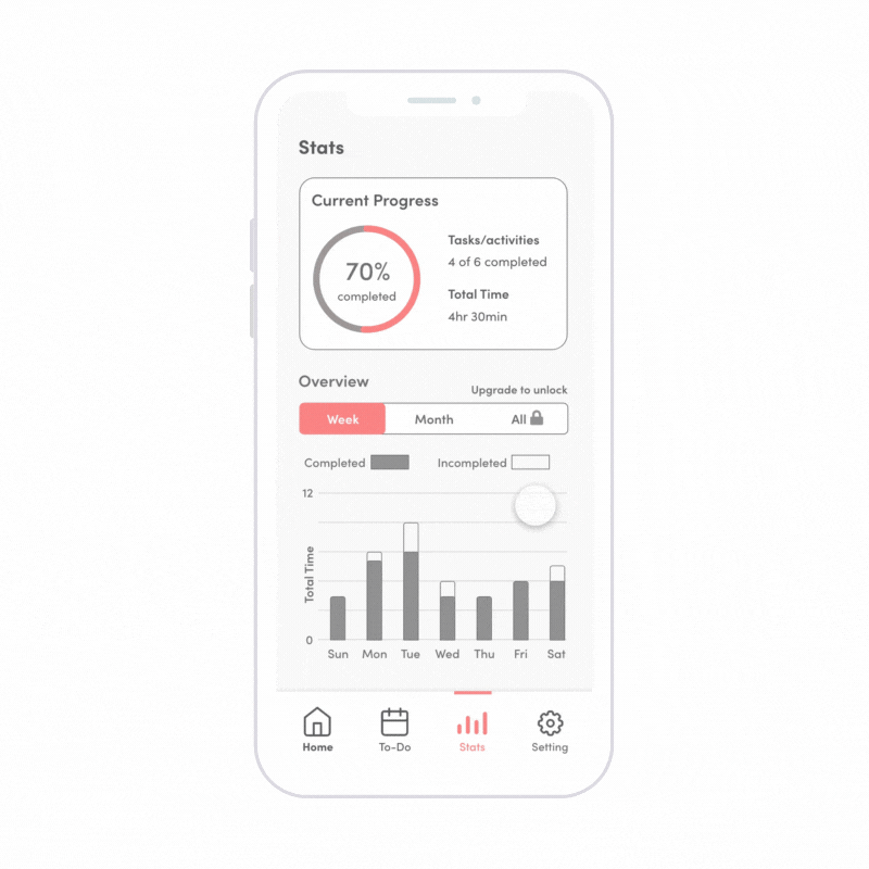
Track Your Progress
Visualized analytics of daily, weekly, and monthly time usage allows users to track and understand their progress.
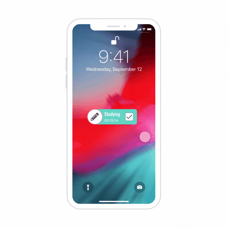
Use The Widget
Helps users stay away from their phones and quickly check the timer without opening the app.
Background
Why are people struggling to maintain their work-life balance?
Mental Health
The pandemic affected people's mental health. It made it difficult to be positive and stay motivated.
Distraction
Staying home made it easy to get distracted with social media apps and other digital escapes.
Time Management
Flexible and hectic schedules made it harder for people to manage their time by themselves.
How might we help students and professionals stay productive and healthy when studying and working from home?
DESIGN PROCESS
Research
User Survey
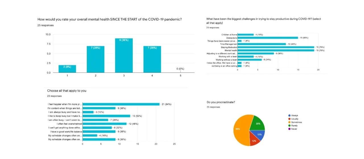
First, we surveyed 27 individuals to ask about how they have been managing their time and maintaining work-life balance during the COVID. We asked questions about:
How do people motivate themselves to maintain productivity?
How the COVID-19 crisis has affected their everyday life?
How do they stay balanced when they’re working/studying from home?
What have been the biggest challenges in trying to stay productive?
What kind of tools do they use to stay on track?
Key insights
While some people enjoy working/studying from home, the majority of people are struggling to maintain motivation and productivity. We also found that more than half of people tend to check their phones for things unrelated to their work schedule. In terms of tools, more than 90% of people use calendars, and about 65% use task trackers.
Empathy & User Journey Map
Next, using the survey results as qualitative data, we started mapping them out into an empathy map and created a user journey map to understand our target users’ needs and pain points they have and brainstorm new ideas.


Competitive Analysis
To gain strategic insights into the features, functions, flows, and feelings of design solutions before making decisions about design strategy, we conducted competitor research on four well known productivity apps in the marketplace.
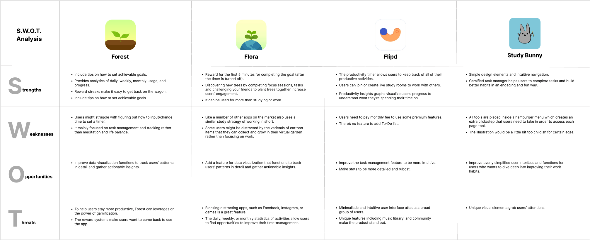
Key findings among the competitors
A productivity timer that allows users to easily and quickly track their activity time can help reduce the manual process and steps to use the app which saves users’ time.
Data visualization of daily, weekly, monthly usage helps users to track their productivity but it might take time for users to understand how to analyze the chart.
The gamification strategy enhances user engagement with the product but it may distract people by pulling their attention away from their tasks and activities.
Define
Personas
To generate user empathy and determine who we’re creating our product, we created two user personas based on the user feedback we received from the user research survey.
User Flow
This flow shows how a user could go through the application. Our goal was to create a smooth and intuitive workflow that a user can start from creating or signing in to an account, activating the timer, and completing the task without distraction.
Ideate
Sketches
Based on key findings from the user research, we started sketching out screens for the key user flows. This helped us communicate our design ideas quickly and envision how the designs would look on each screen before moving further process.

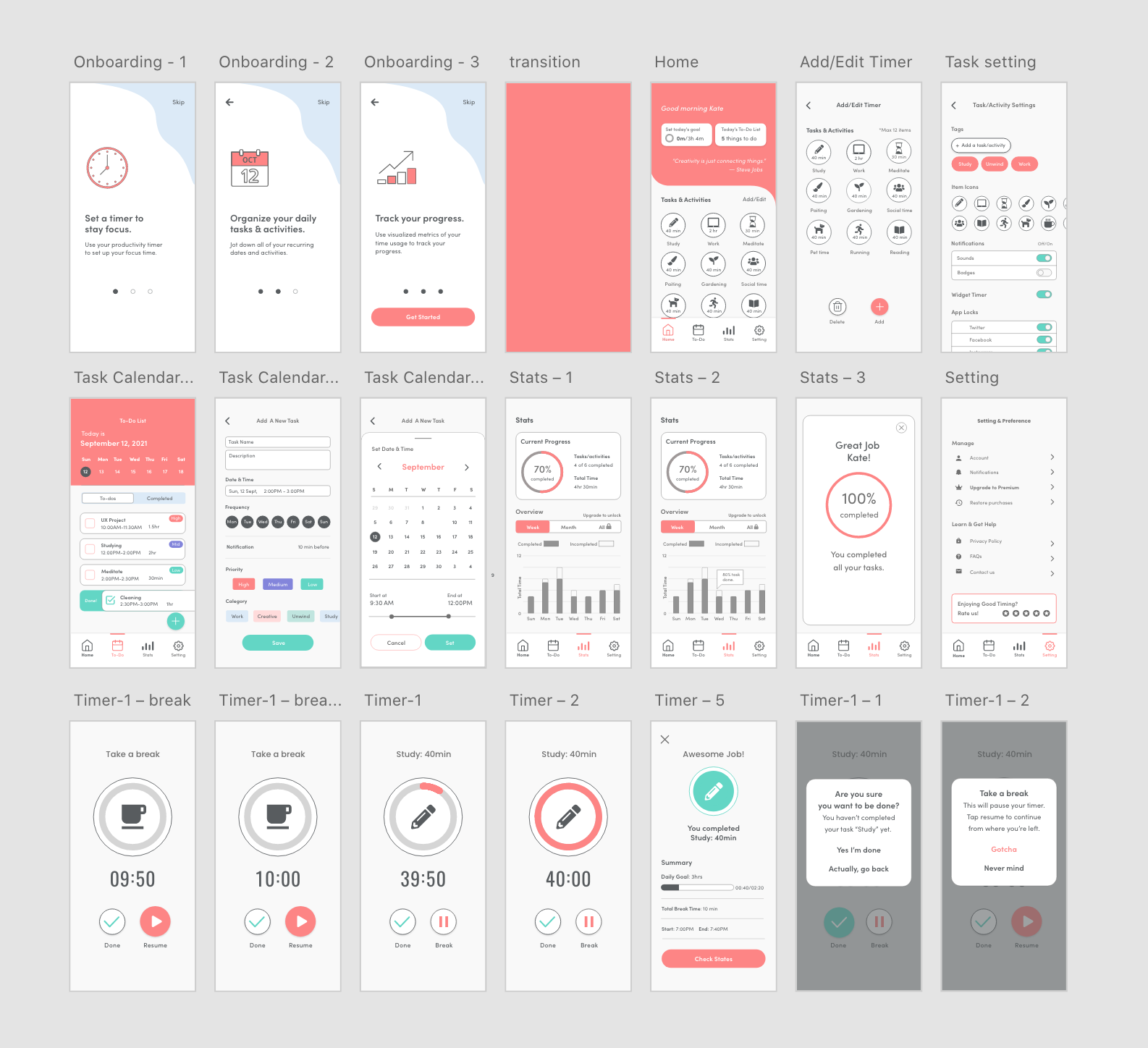
Wireframe
Visual Elements

Prototype
What I learned…
I learned that when solving a problem like this, understanding the mechanism for why people fail, and how to solve it is the core aspect of problem-solving in the design world. And by learning that from this project, I feel like I can now better see that in our project. I also learned how important to listen to users’ voices with empathy and to put aside my assumptions in order to really understand the target users’ needs and pain points.
Next Step
One of the things we can try to do is that make the To-do list/Calendar page look more simple. Some people might feel the information is a little too much and overwhelming. Thus, next time, we can try to scale it down and make it even more minimalistic like the timer, so that users would feel easier and more intuitive to use. Also if I had more time, I would do user testing to validate our solutions and iterate the design process to make more improvements to the product.